
1
Understand
- What is offered?
- Is this for me?
- Which option fits?
Customer Clarity Guide
A website can load correctly and still create hesitation, wrong-fit inquiries, repeated questions, and uncertain next steps. Use real customer confusion to find the pages, language, proof, or expectations that need repair.
Customer journey check
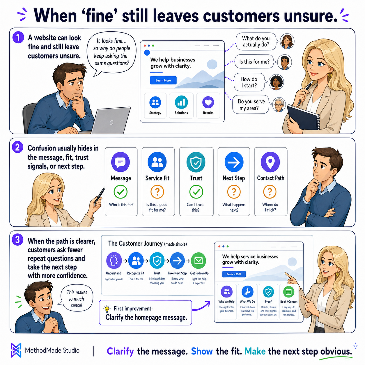
A website can be “fine” in the technical sense and still make customers work too hard. It may load, look respectable, and contain the right contact information while leaving basic questions unanswered. The best evidence is not a design trend. It is the confusion customers already reveal through calls, messages, wrong forms, repeated explanations, and hesitation. Follow those clues before redesigning everything.
The questions people ask, the mistakes they make, and the moments they hesitate are evidence. Begin there instead of guessing what a redesign might fix.
For a week or two, save the questions customers ask before, during, and after contact. Include the explanations staff repeat, misunderstandings that appear in estimates, reasons someone chooses the wrong service, and moments when a person stops because they are unsure what to do next.
Do not dismiss a question because the answer technically exists somewhere on the site. If people cannot find it at the moment they need it, the website is still asking them to do unnecessary work.
A repeated question may point to several different kinds of uncertainty. “Do you do this kind of job?” is usually a fit problem. “What happens after I submit?” is an expectation problem. “Why does this cost more?” may mean the page has not explained scope, preparation, or what changes the work.
Write the visible question and the decision behind it. That makes the repair more useful than simply adding another sentence to a large FAQ page.
Confusion diagnostic
Useful information works best near the moment it helps someone choose—not hidden in a separate page the visitor may never think to open.
Decide where each answer naturally belongs. The homepage should orient the visitor. A service page should explain fit, scope, process, and the next step. The About page should support trust. The contact page should explain what the person is starting and what happens after they reach out.
A large FAQ can be useful for secondary details, but it should not become a storage closet for answers the main customer path needs in order to work.
A service name alone rarely helps someone decide. Explain the real situation that brings a person to the page, who the service is for, what the work includes, what changes timing or scope, and when another option may be a better fit.
The goal is not to persuade everyone to contact the business. It is to help the right person move forward with confidence and help a poor-fit visitor avoid a frustrating inquiry.
Place reviews, credentials, examples, policies, guarantees, or process explanations near the service or decision they strengthen. A relevant customer story beside a service explanation is more useful than a wall of testimonials on a separate page.
Proof should answer the concern in front of the reader. It does not need to be loud; it needs to be specific, credible, and easy to connect to the choice they are considering.
A visitor should know what they are beginning, what information is needed, and what the business will do after the click.
Buttons such as “Learn more” and “Contact us” may be technically correct while still leaving the visitor unsure what they are agreeing to. Use language such as request an estimate, ask a question, book a consultation, check availability, or send project details when that is what the action actually begins.
Then explain the next beat in the story. Will someone call, send scheduling options, review the details, or ask for more information? A small expectation can remove a surprising amount of hesitation.
Review forms on a phone and remove questions that do not help route, understand, or respond to the request. Explain why sensitive information is needed, avoid collecting private details too early, and make required fields obvious without turning the form into an interrogation.
A shorter form is not always better, but every question should earn its place. The customer should understand why they are being asked and the team should actually use the answer.
After submission, tell the customer that the request was received, what usually happens next, when they can reasonably expect a response, and what to do if the matter is urgent. The confirmation page and message are part of the customer experience—not a technical afterthought.
Also test what the team receives. A reassuring customer message cannot compensate for a request that disappears into an unattended inbox or arrives without enough context to respond well.
A contained repair creates evidence. It shows whether clearer information and expectations reduce confusion before the business commits to a larger website project.
Select one important service, booking path, quote request, or contact journey where confusion is frequent or costly. Follow it from the page where the visitor arrives through the form, confirmation, and first business response.
Repair the connected path rather than polishing one isolated page. A clear service explanation still fails when the action is vague, the form asks the wrong questions, or the customer hears nothing afterward.
Ask a few people to explain what the business offers, whether the service fits a given situation, what they would click, and what they expect to happen next. Listen without immediately teaching them the answer. The places where they hesitate are useful evidence.
After the repair, watch whether repeated questions, wrong-fit requests, abandoned forms, and customer uncertainty decrease. Expand the work when the evidence shows another page or path needs attention—not simply because a full redesign still sounds more impressive.
Visual guide
A clear website answers questions before your team has to.
Your action plan
A customer-confusion log and a prioritized repair plan for the pages, messages, service explanations, and contact paths creating the most friction.
Want help applying this?
If this guide describes part of what your business is dealing with, tell us what is happening. We can decide whether there is a useful project, clarify the scope, and estimate it around the actual work involved.
A natural next step
The guide or story below builds naturally on what you just read.
Related practical guide
Audit the website before choosing the project. A cleanup may solve outdated details and broken paths; a refresh may improve content and presentation; a rebuild is justified only when the foundation cannot support what the business now needs.
Read guide →Related experience story
The problem was not a lack of effort or creativity. Long handoffs, offshore dependency, and scarce Kentico knowledge were slowing custom association websites. I redesigned the workflow so discovery, design, content, and development could move together.
Read story →Please don’t share passwords, payment details, medical information, or other sensitive data here.