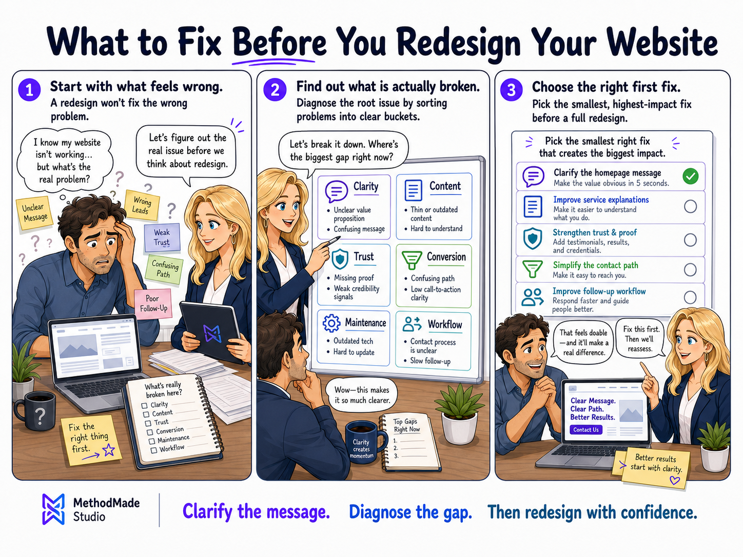
A redesign sounds like a fresh start: new colors, a cleaner layout, updated pages, and new energy. Sometimes that is exactly what the business needs. But a redesign can also become an expensive way to move old confusion into a cleaner-looking container. Before changing the look, it helps to understand what is actually broken.
Start with what feels wrong
Most redesign requests begin with a feeling: the site looks old, does not feel professional, does not explain enough, does not bring in the right leads, or no longer matches the business. Those feelings matter, but they need to be translated into specific problems.
A useful redesign starts by separating visual frustration from structural confusion. The site may need a better design system, clearer service language, stronger proof, a simpler contact path, or a better way to handle requests after submission.
- ✓Does the site look outdated or does it explain the wrong thing?
- ✓Are visitors confused before they contact you?
- ✓Are the wrong people reaching out?
- ✓Does the site fail to show proof, trust, or process?
- ✓Does the team struggle after a form or call comes in?
Fix the message before polishing the layout
A beautiful site with vague copy still creates hesitation. Visitors need to understand what the business does, who it helps, what happens next, and why it is safe to reach out.
Before redesigning, review the homepage promise, service explanations, calls to action, FAQs, proof points, and contact expectations. Many redesigns get easier once the message is clearer.
Look at the handoff after contact
Sometimes the website is blamed because customers fall through the cracks after they reach out. That is not always a website design problem. It may be an intake, ownership, response-time, or follow-up problem.
If the business cannot clearly explain where a request goes, who responds, what status it gets, and what happens next, the redesign should include workflow cleanup instead of only page updates.
- ✓Where do contact forms go?
- ✓Who owns the first response?
- ✓What information is missing most often?
- ✓What does the customer expect after reaching out?
- ✓Where does the team track status?
Decide whether the first fix is smaller than a redesign
A full redesign may still be the right answer. But sometimes the best first move is smaller: rewrite one service page, improve one call to action, clarify the contact form, update proof, clean up navigation, or create a better follow-up path.
Small fixes can reveal whether the website truly needs a full rebuild or whether the business mostly needed clarity in the places customers were already getting stuck.